<前端技术>css代码段
目录:
鼠标放上去会有边框
<!DOCTYPE html>
<html lang="en">
<head>
<meta charset="UTF-8">
<title>Title</title>
<style>
.ele{
background-color: #dddddd;
}
.ele:hover{
border: 2px solid red;
}
</style>
</head>
<body>
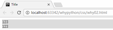
<div class="ele">
<div>123</div>
<div>123</div>
</div>
</body>
</html>
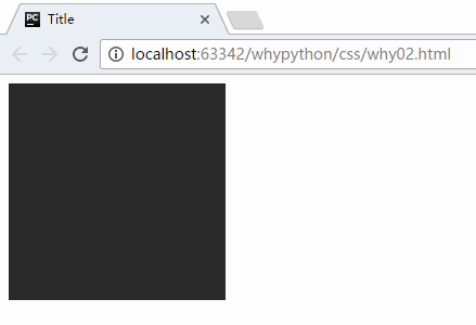
实现的方式是通过鼠标放在上边的hover效果,增加了一个2px的红色边框实现的。
展示效果
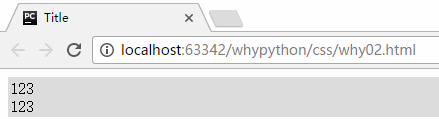
但是有一个问题,增加了边框,会移动2px,解决方式可以给其增加一个透明的边框
<head>
    <meta charset="UTF-8">
    <title>Title</title>
    <style>
        .ele{
            background-color: #dddddd;
            border: 2px solid transparent;
        }
        .ele:hover{
            border: 2px solid red;
        }
    </style>
</head>
<body>
<div class="ele">
    <div>123</div>
    <div>123</div>
</div>
</body>
展示效果
鼠标放上去会有其他的显示
<!DOCTYPE html>
<html lang="en">
<head>
    <meta charset="UTF-8">
    <title>Title</title>
    <style>
        .touch{
            width: 200px;
            height: 200px;
            overflow: hidden;
            position: relative;
        }
        .touch .content{
            position:absolute;
            top: 0;
            left: 0;
            right: 0;
            bottom: 0;
            color: white;
            text-align: center;
            visibility: hidden;
            background: rgba(0,255,0,.3);
        }
        .touch:hover .content{
            visibility: visible;
        }
        .touch .content .c1{
            font-size: 32px;
            padding: 30px 0;
        }
    </style>
</head>
<body>
<div class="touch">
    <div><img src="a.png"></div>
    <div class="content">
        <div class="c1">why</div>
        <div class="c2">python自动化运维</div>
    </div>
</div>
</body>
</html>
- overflow: hidden;图片的显示根据规定高度显示,如果超过该高度会进行裁剪。
- visibility: hidden;元素隐藏
实现的方式是通过content类的div标签通过hover伪类实现鼠标放上去显示我们想要的展示,两个div标签通过position的relative和absolute实现嵌套,将上右下左的距离设置为0px占满窗体,然后c1和c2只是用来显示不同大小字体使用的。
展示效果
固定
<!DOCTYPE html>
<html lang="en">
<head>
    <meta charset="UTF-8">
    <title>Title</title>
</head>
<body>
    <div style="height: 2000px; background-color: red">
        <div style="position: relative; background-color: green; width: 500px; height: 130px; margin: 0 auto;">
            <div style="position: absolute; left: 0; bottom: 0; width: 40px; height: 40px; background-color: pink;"></div>
        </div>
    </div>
    <div style="position: fixed; right: 10px; bottom: 10px; width: 40px; height: 40px; background-color: violet;"></div>
</body>
</html>
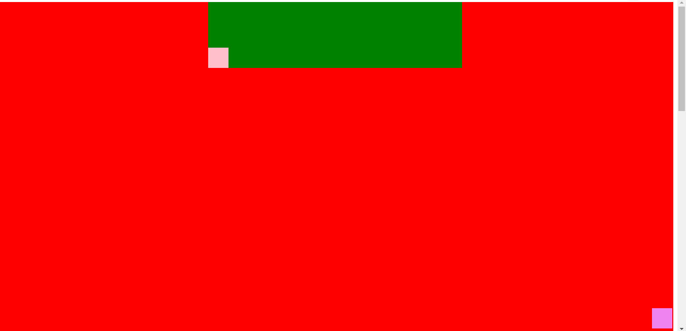
- 固定在右下角通过
<div style="position: fixed; right: 10px; bottom: 10px; width: 40px; height: 40px; background-color: violet;"></div>实现,fixed进行固定并且飘起来了,距离右下角10px,长宽为40px,背景颜色为violet。
展示效果
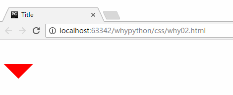
通过边框画三角形
<!DOCTYPE html>
<html lang="en">
<head>
<meta charset="UTF-8">
<title>Title</title>
<style>
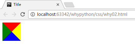
.up{
border-top: 30px solid red;
border-right: 30px solid yellow;
border-bottom: 30px solid blue;
border-left: 30px solid green;
display: inline-block;
}
</style>
</head>
<body>
<div class="up"></div>
</body>
</html>
通过border的反复覆盖实现。
展示效果
<!DOCTYPE html>
<html lang="en">
<head>
<meta charset="UTF-8">
<title>Title</title>
<style>
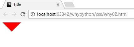
.up{
border-top: 30px solid red;
border-right: 30px solid transparent;
border-bottom: 30px solid transparent;
border-left: 30px solid transparent;
display: inline-block;
}
</style>
</head>
<body>
<div class="up"></div>
</body>
</html>
只显示一个就通过其他三个为透明即可。
<!DOCTYPE html>
<html lang="en">
<head>
    <meta charset="UTF-8">
    <title>Title</title>
    <style>
        .c1{
            border: 30px solid transparent;
            border-top: 30px solid red;
            margin-top: 40px;
            display: inline-block;
        }
        .c1:hover{
            border: 30px solid transparent;
            border-bottom: 30px solid red;
            margin-top: 10px;
        }
    </style>
</head>
<body>
    <div style="height: 100px;">
        <div class="c1"></div>
    </div>
</body>
</html>
通用图标
通用图标可以去该网址找 连接
<!DOCTYPE html>
<html lang="en">
<head>
    <meta charset="UTF-8">
    <title>Title</title>
    <link rel="stylesheet" href="font-awesome-4.7.0/css/font-awesone.css">
</head>
<body>
    <span class="fa fa-cut"></span>
</body>
</html>
放到html同级目录可以写相对路径
示例效果
前端目录规范
- app
    - index.html
    - blog.html
- css
    - commons.css
- script
    - commons.js
- plugin
    - bootstrap
解决IE浏览器img标签的图片有边框问题
img{
    border: 0;
}
属性强制生效
实现方式!important
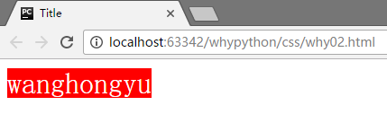
属性默认生效方式
<!DOCTYPE html>
<html lang="en">
<head>
    <meta charset="UTF-8">
    <title>Title</title>
    <style>
    .c2{
        color: aqua;
    }
    .c1{
        font-size: 32px;
        background-color: red;
        color: white;
    }
    </style>
</head>
<body>
    <span class="c1 c2">wanghongyu</span>
</body>
</html>
展示效果
可以看到c2的aqua颜色生效了,然后我们把c1 c2换为c2 c1。
<!DOCTYPE html>
<html lang="en">
<head>
    <meta charset="UTF-8">
    <title>Title</title>
    <style>
    .c2{
        color: aqua;
    }
    .c1{
        font-size: 32px;
        background-color: red;
        color: white;
    }
    </style>
</head>
<body>
    <span class="c2 c1">wanghongyu</span>
</body>
</html>
展示效果
可以看到c1的while生效了所以生效方式与class中类前后没有关系。
调整style中的c1和c2的前后顺序
<!DOCTYPE html>
<html lang="en">
<head>
    <meta charset="UTF-8">
    <title>Title</title>
    <style>
    .c1{
        font-size: 32px;
        background-color: red;
        color: white;
    }
    .c2{
        color: aqua;
    }
    </style>
</head>
<body>
    <span class="c2 c1">wanghongyu</span>
</body>
</html>
展示效果
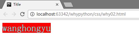
可以看到c2中的aqua属性生效了,这个相同属性生效取决于在style中顺序,在下边的生效,也可以理解为下边的属性覆盖了上边的属性。
强制属性生效
<!DOCTYPE html>
<html lang="en">
<head>
    <meta charset="UTF-8">
    <title>Title</title>
    <style>
    .c1{
        font-size: 32px;
        background-color: red;
        color: white !important;
    }
    .c2{
        color: aqua;
    }
    </style>
</head>
<body>
    <span class="c2 c1">wanghongyu</span>
</body>
</html>
可以看到正常的情况下,会是颜色aque生效,而因为添加了important,颜色white强制生效。
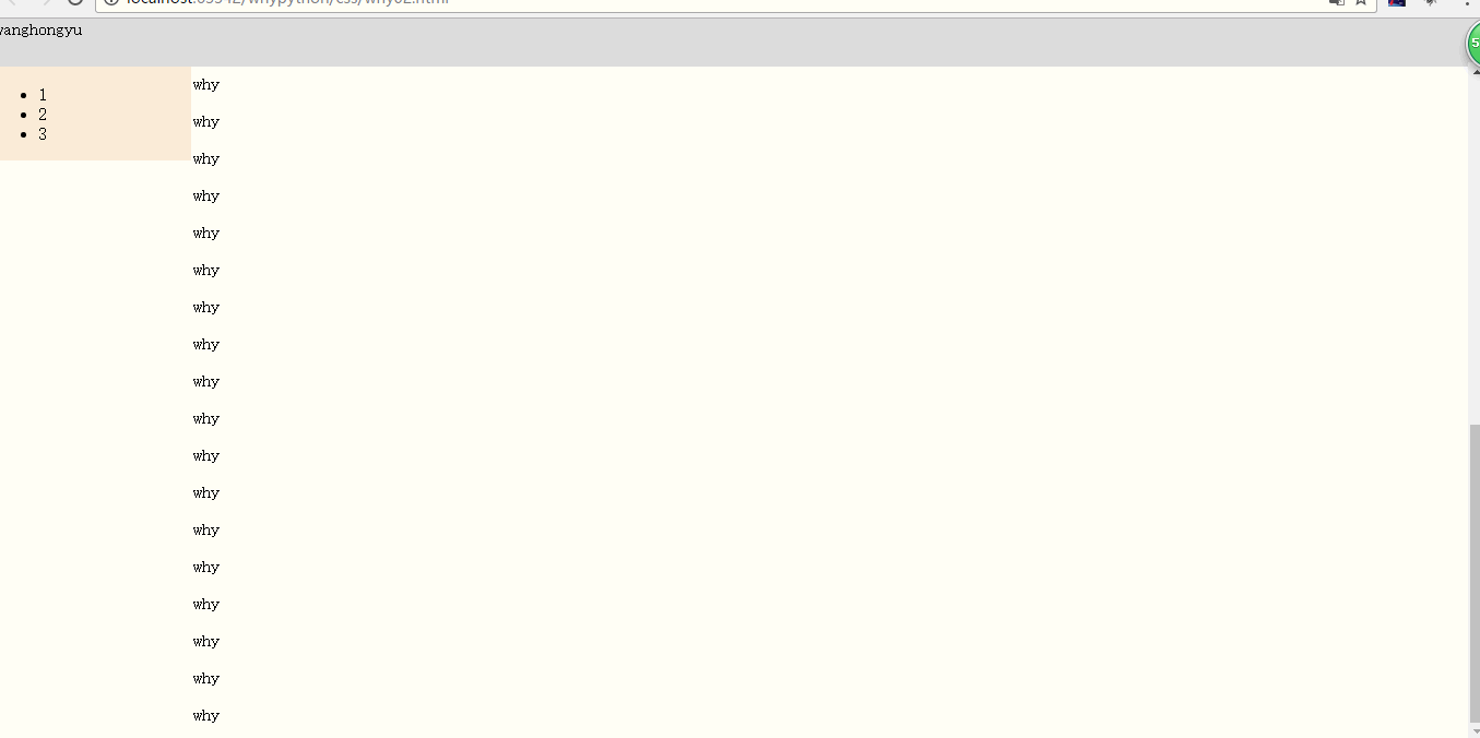
设置分栏显示
<!DOCTYPE html>
<html lang="en">
<head>
    <meta charset="UTF-8">
    <title>Title</title>
    <style>
        body{
            margin: 0;
        }
        .pg-header{
            height: 44px;
            background-color: #dddddd;
        }
        .pg-body .body-menu{
            position: absolute;
            width: 180px;
            background-color: antiquewhite;
            left: 0;
        }
        .pg-body .body-content{
            position: absolute;
            top: 40px;
            left: 182px;
            right: 0;
            bottom: 0;
            background-color: bluevialet;
            overflow: auto;
        }
    </style>
</head>
<body>
    <div class="pg-header">wanghongyu</div>
    <div class="pg-body">
        <div class="body-menu">
            <ul>
                <li>1</li>
                <li>2</li>
                <li>3</li>
            </ul>
        </div>
        <div class="body-content">
            <p>why</p><p>why</p><p>why</p><p>why</p><p>why</p><p>why</p><p>why</p><p>why</p><p>why</p><p>why</p><p>why</p><p>why</p><p>why</p>
            <p>why</p><p>why</p><p>why</p><p>why</p><p>why</p><p>why</p><p>why</p><p>why</p><p>why</p><p>why</p><p>why</p><p>why</p><p>why</p>
            <p>why</p><p>why</p><p>why</p><p>why</p><p>why</p><p>why</p><p>why</p><p>why</p><p>why</p><p>why</p><p>why</p><p>why</p><p>why</p>
        </div>
    </div>
</body>
</html>
展示效果
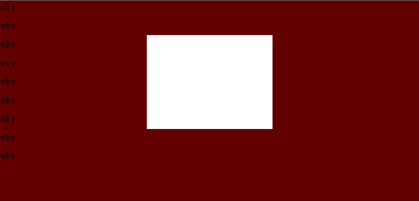
显示悬浮框
<!DOCTYPE html>
<html lang="en">
<head>
    <meta charset="UTF-8">
    <title>Title</title>
    <style>
       body{
            margin; 0;
        }
        .model{
            position: fixed;
            top: 0;
            bottom: 0;
            left: 0;
            right: 0;
            background: rgba(0, 0, 0, .6)
        }
        .content{
            height: 300px;
            width: 400px;
            background-color: white;
            position: fixed;
            top: 50%;
            left: 50%;
            z-index: 3;
            margin-left: -200px;
            margin-top: -200px;
        }

    </style>
</head>
<body>
    <div style="height: 2000px;background-color: red">
        <h1>why</h1><h1>why</h1><h1>why</h1><h1>why</h1><h1>why</h1><h1>why</h1><h1>why</h1><h1>why</h1><h1>why</h1>
    </div>
    <div class="model"></div>
    <div class="content"></div>
</body>
</html>
展示效果
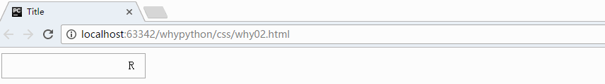
输入框
<!DOCTYPE html>
<html lang="en">
<head>
    <meta charset="UTF-8">
    <title>Title</title>
    <style>
        .user{
            position: relative;
            width: 250px;
        }
        .user input{
            height: 30px;
            width: 170px;
            padding-right: 30px;
        }
        .user .ren{
            position: absolute;
            top: 8px;
            left: 180px;
        }
    </style>
</head>
<body>
    <div class="user">
        <input type="text">
        <span class="ren">R</span>
    </div>
</body>
</html>
展示效果