
<前端技术>css
目录:
什么是css
CSS是Cascading Style Sheets的简称,中文称为层叠样式表,用来控制网页数据的表现,可以使网页的表现与数据内容分离
简单点讲,css可以修饰html中的标签属性。
更多的可以参考http://www.w3school.com.cn/h.asp
css的四种引入模式
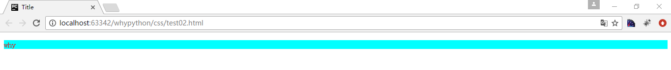
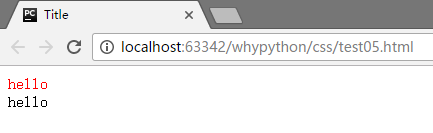
行内式
行内式是在标记的style属性中设定css样式,不过这样使用并不能体现出css的优势,所以并不推荐使用。
<!DOCTYPE html>
<html lang="en">
<head>
    <meta charset="UTF-8">
    <title>Title</title>
</head>
<body>
    <p style="background-color:aqua;color:red">why</p>
</body>
</html>
展示效果

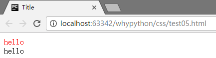
嵌入式
嵌入式是将css的样式集中写在网页的<head></head>标签中
<!DOCTYPE html>
<html lang="en">
<head>
    <meta charset="UTF-8">
    <title>Title</title>
    <style>
        p{
            background-color:aqua;
            color:red;
        }

    </style>
</head>
<body>
    <p>why</p>
</body>
</html>
展示效果
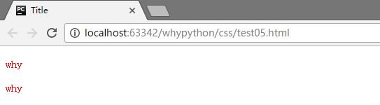
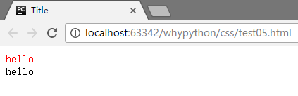
导入式
导入式是将一个独立的css文件引入HTML文件中,导入使用CSS规则引入外部的css文件,<style>标记也是写在<head>标记中
<!DOCTYPE html>
<html lang="en">
<head>
    <meta charset="UTF-8">
    <title>Title</title>
    <style>
        @import "test03.css"
    </style>
</head>
<body>
    <p>why</p>
</body>
</html>
test03.css代码
        p{
            background-color:aqua;
            color:red;
        }
展示效果

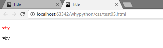
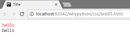
链接式
和导入式使用方式类似,但是展示的时候方式不同
<!DOCTYPE html>
<html lang="en">
<head>
    <meta charset="UTF-8">
    <title>Title</title>
    <link href="test03.css" rel="stylesheet">
</head>
<body>
    <p>why</p>
</body>
</html>
展示效果

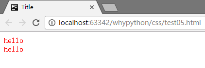
导入式会在网页装载完成后,再装载css文件,因此这样就导致了一个问题,如果网页比较大的话,就是先显示无样式的页面,然后闪烁一下,再出现网页样式。 而使用链接式与导入式不同的是,会在网页主体文件装载前先装载css文件,因此显示出来的网页从一开始就是带样式的效果,不会像导入式那样最开始的时候是无样式的网页,然后是有样式的文件。
所以我们在导入css的时候,直接用链接式即可。
css注释
/* 注解注释内容 */
css选择器(selector)
选择器指明了{}中的样式的作用对象,或者说作用于网页中那些元素
基础选择器
通用元素选择器*
匹配任何元素
<!DOCTYPE html>
<html lang="en">
<head>
    <meta charset="UTF-8">
    <title>Title</title>
    <style>
        * {
            color:red;
        }
    </style>
</head>
<body>
    <p>why</p>
    <div>why</div>
</body>
</html>
展示效果
可以看到p标签和div标签内的文本都被添加css样式
标签选择器
匹配所有使用该标签的元素
<!DOCTYPE html>
<html lang="en">
<head>
    <meta charset="UTF-8">
    <title>Title</title>
    <style>
        p {
            color:red;
        }
    </style>
</head>
<body>
    <p>why</p>
    <div>why</div>
</body>
</html>
展示效果
可以看到p标签进行了渲染,而div标签没有
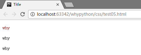
class选择器
匹配所有class属性中包含www的元素
<!DOCTYPE html>
<html lang="en">
<head>
    <meta charset="UTF-8">
    <title>Title</title>
    <style>
        .www {
            color:red;
        }
    </style>
</head>
<body>
    <p class="www">why</p>
    <p>why</p>
</body>
</html>
展示效果
可以看到只有class为www的内容进行了渲染
class选择器可以根据标签进行选择,下边为示例代码
<!DOCTYPE html>
<html lang="en">
<head>
    <meta charset="UTF-8">
    <title>Title</title>
    <style>
        p.www {
            color:red;
        }
    </style>
</head>
<body>
    <p class="www">why</p>
    <p>why</p>
    <div class="www">why</div>
</body>
</html>
展示效果
只有p标签中的有class为www的进行了渲染,而p标签和div标签中的class为www的文本都没有被进行渲染
id选择器
通过比配id来实现渲染
<!DOCTYPE html>
<html lang="en">
<head>
    <meta charset="UTF-8">
    <title>Title</title>
    <style>
        #www {
            color:red;
        }
    </style>
</head>
<body>
    <p id="www">why</p>
    <p>why</p>
</body>
</html>
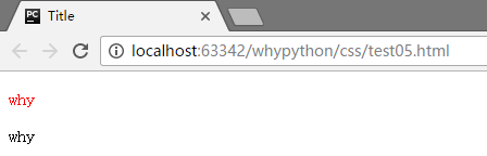
可以看到只有id为www中的内容被进行了渲染。
另外对于id也有p#www的操作,只匹配p标签中的www的id
注意,id是唯一的,而class是可以重复的。
组合选择器
多元素选择器
- E,F 同时匹配所有E和所有F有的标签元素,用逗号隔开
<!DOCTYPE html>
<html lang="en">
<head>
    <meta charset="UTF-8">
    <title>Title</title>
    <style>
        p,div {
            color:red;
        }
    </style>
</head>
<body>
    <p>why</p>
    <div>why</div>
    <a>why</a>
</body>
</html>
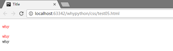 可以看到p标签和div标签的内容都进行了渲染,而a标签没有进行渲染
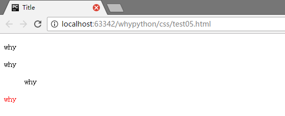
后代元素选择器
- E F 匹配所有属于E元素的后代F元素,E和F之间用空格隔开
<!DOCTYPE html>
<html lang="en">
<head>
    <meta charset="UTF-8">
    <title>Title</title>
    <style>
        .r1 p {
            color:red;
        }
    </style>
</head>
<body>
    <div class="r1">why1
        <div class="r2">why2
            <p>why3</p>
        </div>
        <p>why4</p>
    </div>
</body>
</html>
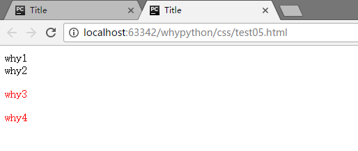
可以看到why3和why4的被进行了渲染,why4为r1类的p标签中,而why3在r1的r2的p标签中,都被进行了渲染。
<!DOCTYPE html>
<html lang="en">
<head>
    <meta charset="UTF-8">
    <title>Title</title>
    <style>
        p div {
            color:red;
        }
        div p {
            color:red;
        }
    </style>
</head>
<body>
    <p>why</p>
    <div>why</div>
    <p><dir>why</dir></p>
    <div><p>why</p></div>
</body>
</html>
<p>标签不能嵌套块标签,嵌套的话等于没嵌套
展示效果
子元素选择器
- E>F 匹配所有E元素的子元素F
<!DOCTYPE html>
<html lang="en">
<head>
    <meta charset="UTF-8">
    <title>Title</title>
    <style>
        .r1>p {
            color:red;
        }
    </style>
</head>
<body>
    <div class="r1">why1
        <div class="r2">why2
            <p>why3</p>
        </div>
        <p>why4</p>
    </div>
</body>
</html>
展示效果
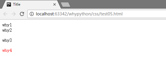
可以看到why4被进行了渲染,why4为r1类的p标签中,被进行了渲染,而why3在r1的r2的p标签中,没有被进行了渲染。
毗邻元素选择器
- E+F 匹配所有紧随着E元素之后的同级元素F
<!DOCTYPE html>
<html lang="en">
<head>
    <meta charset="UTF-8">
    <title>Title</title>
    <style>
        .r2+p {
            color:red;
        }
    </style>
</head>
<body>
    <div class="r1">why1
        <div class="r2">why2
            <p>why3</p>
        </div>
        <p>why4</p>
        <p>why5</p>
    </div>
</body>
</html>
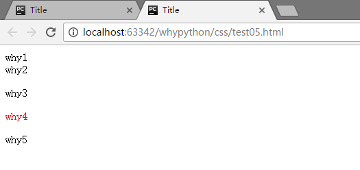
可以看到why4被进行了渲染
注意事项
- 块级元素可以包含内联元素或某些块级元素,但是内联元素不能包含块级元素,只能包含其他内联元素
- 块级元素不能放在p里边
- 几个特殊的块级元素只能包含内联元素,不能包含块元素,如h1,h2,h3,h4,h5,h6,p,dt
- li内可以包含div
- 块级元素和块级元素并列,内联元素与内联元素并列,错误示例:
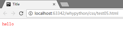
属性选择器
[why] 匹配所有具有why属性
<!DOCTYPE html>
<html lang="en">
<head>
    <meta charset="UTF-8">
    <title>Title</title>
    <style>
        [why] {
            color:red;
        }
    </style>
</head>
<body>
    <div why="wanghongyu">hello</div>
</body>
</html>
也可以指定标签
E[why="wanghongyu"] 匹配所有why属性为wanghongyu的标签
<!DOCTYPE html>
<html lang="en">
<head>
    <meta charset="UTF-8">
    <title>Title</title>
    <style>
        [why="wanghongyu"] {
            color:red;
        }
    </style>
</head>
<body>
    <div why="wanghongyu">hello</div>
    <div why="wanghong">hello</div>
</body>
</html>
E[why~="wanghongyu"] 匹配以空格隔开的属性中有wanghongyu的标签
<!DOCTYPE html>
<html lang="en">
<head>
    <meta charset="UTF-8">
    <title>Title</title>
    <style>
        [why~="wanghongyu"] {
            color:red;
        }
    </style>
</head>
<body>
    <div why="wang wanghongyu">hello</div>
    <div why="wanghong">hello</div>
</body>
</html>
展示效果
E[why|=wang] 通过连字符连接,且首部为wang
<!DOCTYPE html>
<html lang="en">
<head>
    <meta charset="UTF-8">
    <title>Title</title>
    <style>
        [why|=wang] {
            color:red;
        }
    </style>
</head>
<body>
    <div why="wang-hong">hello</div>
    <div why="wang-hy">hello</div>
</body>
</html>
展示效果
可以看到两个div标签都被进行了渲染
E[why^=wang] 匹配以wang开头的标签属性
<!DOCTYPE html>
<html lang="en">
<head>
    <meta charset="UTF-8">
    <title>Title</title>
    <style>
        [why|=wang] {
            color:red;
        }
    </style>
</head>
<body>
    <div why="wanghy">hello</div>
    <div why="why">hello</div>
</body>
</html>
展示效果
E[why$=yu] 匹配why标签以yu结尾的属性
<!DOCTYPE html>
<html lang="en">
<head>
    <meta charset="UTF-8">
    <title>Title</title>
    <style>
        [why$=yu] {
            color:red;
        }
    </style>
</head>
<body>
    <div why="wanghongyu">hello</div>
    <div why="wanghong">hello</div>
</body>
</html>
展示效果
E[why*=hong] 匹配why标签包含hong的属性
<!DOCTYPE html>
<html lang="en">
<head>
    <meta charset="UTF-8">
    <title>Title</title>
    <style>
        [why*=hong] {
            color:red;
        }
    </style>
</head>
<body>
    <div why="wanghongyu">hello</div>
    <div why="wanghy">hello</div>
</body>
</html>
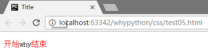
p:before和p:after
在开头和结尾添加内容
<!DOCTYPE html>
<html lang="en">
<head>
    <meta charset="UTF-8">
    <title>Title</title>
    <style>
        p:before{
            content: "开始";
            color: red
        }
        p:after{
            content: "结束";
            color: red
        }
    </style>
</head>
<body>
    <p>why</p>
</body>
</html>
展示效果
伪类选择器
专用于控制链接的显示效果
- a:link(没有接触过的链接),用于定义了链接的常规状态。
- a:hover(鼠标放在链接上的状态),用于产生视觉效果。
- a:visited(访问过的链接),用于阅读文章,能清楚的判断已经访问过的链接。
- a:active(在链接上按下鼠标时的状态),用于表现鼠标按下时的链接状态。
<!DOCTYPE html>
<html lang="en">
<head>
    <meta charset="UTF-8">
    <title>Title</title>
    <style type="text/css">
    a:link{
        color: red;
    }
    a:visited {
        color: blue;
    }
    a:hover {
        color: green;
    }
    a:active {
        color: yellow;
    }
</style>
</head>
<body>
    <a href="http://www.whysdomain.com" >whysdomain</a>
</body>
</html>
css属性
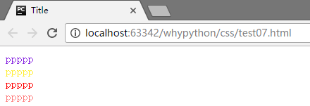
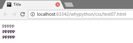
颜色属性
<!DOCTYPE html>
<html lang="en">
<head>
    <meta charset="UTF-8">
    <title>Title</title>
</head>
<body>
   <div style="color:blueviolet">ppppp</div>
   <div style="color:#ffee33">ppppp</div>
   <div style="color:rgb(255,0,0)">ppppp</div>
   <div style="color:rgba(255,0,0,0.5)">ppppp</div>
</body>
</html>
- style="color:blueviolet"通过直接指定color单词来指定颜色
- style="color:#ffee33"通过六个十六进制字符表示颜色
- style="color:rgb(255,0,0)"通过red红色,green绿色和blue蓝色来表示颜色
- style="color:rgba(255,0,0,0.5)"在上一个基础上添加了透明度
展示效果
字体属性
<!DOCTYPE html>
<html lang="en">
<head>
    <meta charset="UTF-8">
    <title>Title</title>
</head>
<body>
   <div>ppppp</div>
</body>
</html>
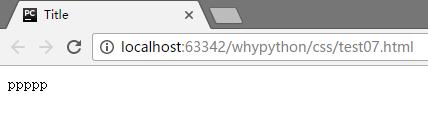
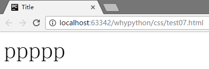
字体大小
<!DOCTYPE html>
<html lang="en">
<head>
    <meta charset="UTF-8">
    <title>Title</title>
    <style>
        div{
            font-size: 50px
        }
    </style>
</head>
<body>
   <div>ppppp</div>
</body>
</html>
展示效果
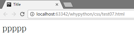
font-size: 200%
展示效果
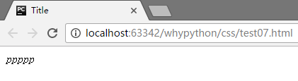
斜体
font-style: oblique
展示效果
字体
font-family:'SimSun'
不过我没看出有太多的效果
加粗
<!DOCTYPE html>
<html lang="en">
<head>
    <meta charset="UTF-8">
    <title>Title</title>
    <style>
        div.normal{
            font-weight:normal;
        }
        div.thick{
            font-weight:bold;
        }
        div.thicker{
            font-weight:900;
        }
    </style>
</head>
<body>
    <div class="normal">ppppp</div>
    <div class="thick">ppppp</div>
    <div class="thicker">ppppp</div>
</body>
</html>
展示效果
背景属性
<!DOCTYPE html>
<html lang="en">
<head>
    <meta charset="UTF-8">
    <title>Title</title>
    <style>
        html{
            background-color: antiquewhite;

        }
        body{
            width: 600px;
            height: 600px;
            background-color: deeppink;
            background-image: url(1.png);
            background-repeat: no-repeat;
            background-position: center center;
        }
    </style>
</head>
<body>
</body>
</html>
展示效果
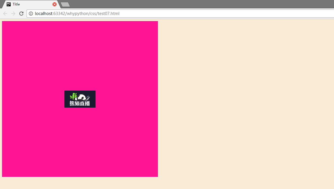
- html标签设置背景颜色,可以看到所有网页都是一个近似肉色的颜色。background-color为背景颜色
- body标签定义大小为高度height为600像素,宽度width为600像素,宽度的话默认为屏幕从左到右,所以默认可以不写,但是height一定要有,需要撑起固定长度用于展示内容。
- 背景图片为background-image,background-repeat为展示方式,no-repeat代表不进行平铺,repeat代表平铺满。
- background-position表示水平方向和竖直方向上的位置,第一个center是水平方向居中,第二个center是竖直方向居中,当然也横向可以定义left和right,纵向可以定义top和botton,也可以直接定义距离左边和上边的像素大小,例如20px 20px。
刚才就可简写为<body style="width: 300px;height: 300px; background: center center no-repeat deeppink url('1.png')"
文本属性
<!DOCTYPE html>
<html lang="en">
<head>
    <meta charset="UTF-8">
    <title>Title</title>
    <style>
        p{
        width: 200px;
        height: 200px;
        text-align: center;
        background-color: aquamarine;
        line-height: 200px;
        }
    </style>
</head>
<body>
<p>why</p>
</body>
</html>
展示效果
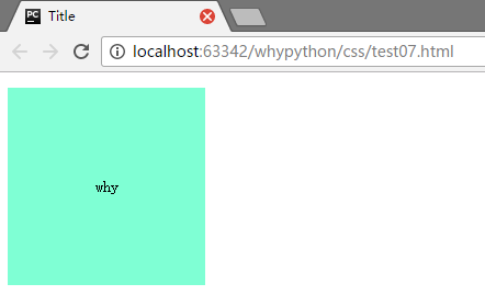
- text-align: center;文本横向居中
- line-height: 200px;文本行高200像素
- text-indent: 150px;首行缩进
- direction: rtl;文本从右向左
- letter-spacing: 10px;字母之间的间距
- word-spacing: 20px;单词之间的间距
- text-transform: capitalize;字母的大小写,uppercase所有字母大写,capitalize字母小写,lowercase首字母大写
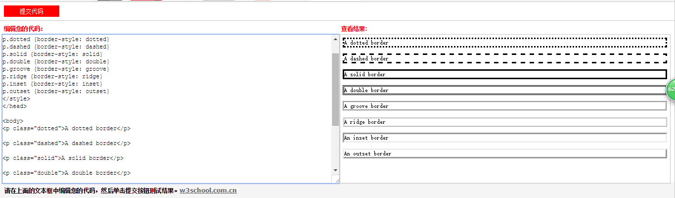
边框属性
<!DOCTYPE html>
<html lang="en">
<head>
    <meta charset="UTF-8">
    <title>Title</title>
    <style>
        p{
        width: 200px;
        height: 200px;
        text-align: center;
        background-color: aquamarine;
        line-height: 200px;
        border-style: solid;
        border-color: chartreuse;
        border-width: 20px;
        }
    </style>
</head>
<body>
<p>why</p>
</body>
</html>
展示效果
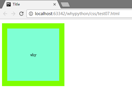
- border-style: solid;边框的样式
- border-color: chartreuse;边框的颜色
- border-width: 20px;边框宽度
转载自w3school的样式
列表属性
<!DOCTYPE html>
<html lang="en">
<head>
    <meta charset="UTF-8">
    <title>Title</title>
    <style>
        ul,ol{
        list-style: none;
    </style>
</head>
<body>
<ul>
    <ol>why</ol>
    <ol>why</ol>
    <ol>why</ol>
</ul>
</body>
</html>
展示效果
- list-style: none;无
- list-style: circle;空心圆
display属性
display:inline;
- block此元素将显示为块级元素,此元素前后会带有换行符。
- inline默认。此元素会被显示为内联元素,元素前后没有换行符。
- none此元素不会被显示。
内联标签不能设置长宽,只有块级标签才能设置。
none是一个重要的属性,轮播图就是通过这种方式进行设置的。bxslider.com,提供一个很好用的轮播图插件。
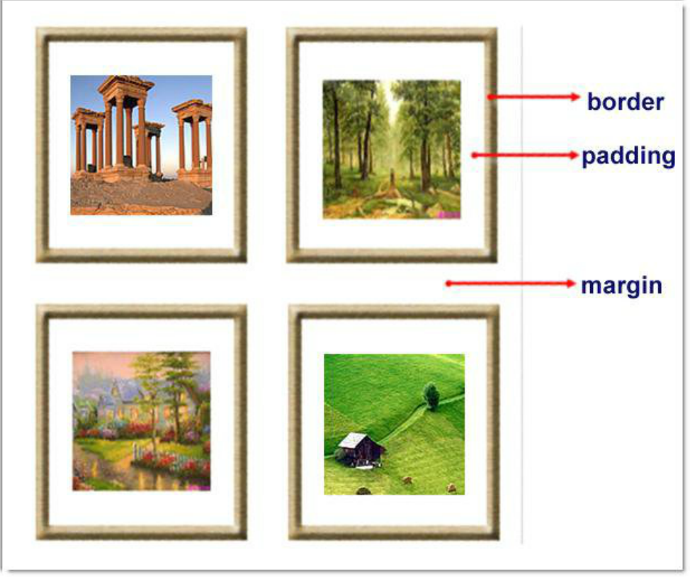
盒子模型
创建盒子
<!DOCTYPE html>
<html lang="en">
<head>
    <meta charset="UTF-8">
    <title>Title</title>
    <style>
        .outer{
            width: 300px;
            height: 300px;
            background-color: antiquewhite;
        }
        .inter{
            width: 100px;
            height: 100px;
            background-color: rebeccapurple;
        }
    </style>
</head>
<body>
<div class="outer">
    <div class="inter"></div>
</div>
</body>
</html>
展示效果
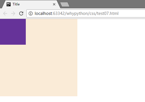
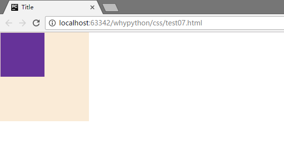
这样就设计好两个盒子了,并且可以看到左上角并不是贴着浏览器的边缘,这是因为body是在html中,我们的边缘为body的边缘,body和html之间会有若干像素的margin
解决body和html中有像素距离
解决方式为body标签添加属性
        body{
            margin: 0;
        }
展示效果
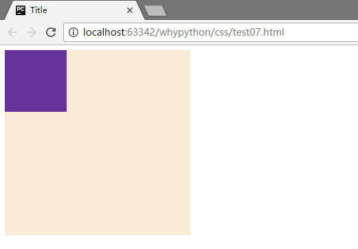
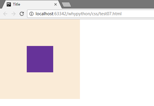
盒子居中
<!DOCTYPE html>
<html lang="en">
<head>
    <meta charset="UTF-8">
    <title>Title</title>
    <style>
        body{
            margin: 0;
        }
        .outer{
            width: 300px;
            height: 300px;
            background-color: antiquewhite;
        }
        .inter{
            width: 100px;
            height: 100px;
            background-color: rebeccapurple;
            margin-top: 100px;
            margin-left: 100px;
        }
    </style>
</head>
<body>
<div class="outer">
    <div class="inter"></div>
</div>
</body>
</html>
展示效果
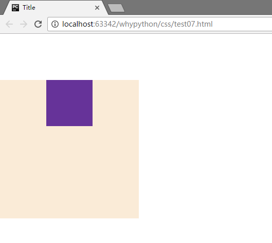
可以看到左右下都是对齐的
塌陷问题解决方式
添加一行代码
        .outer{
            width: 300px;
            height: 300px;
            background-color: antiquewhite;
            border: 1px solid transparent;
        }
展示效果
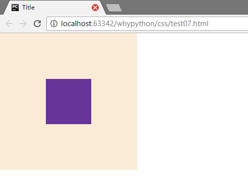
当然还有其他的方式
- border:1px solid transparent
- padding:1px
- over-flow:hidden;
塌陷问题的原因
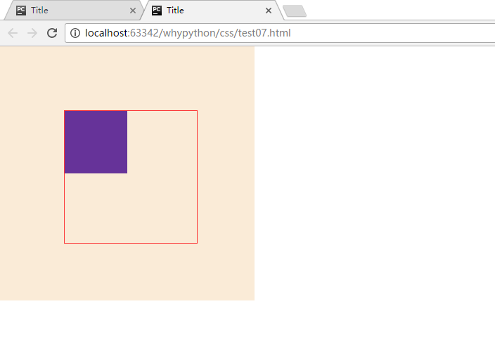
可以看到横向距离是没有问题的,而纵向有问题,塌陷的原因是inter因为向上无法找到元素,边界、文本和padding都没有。
我们通过多个盒子进行展示
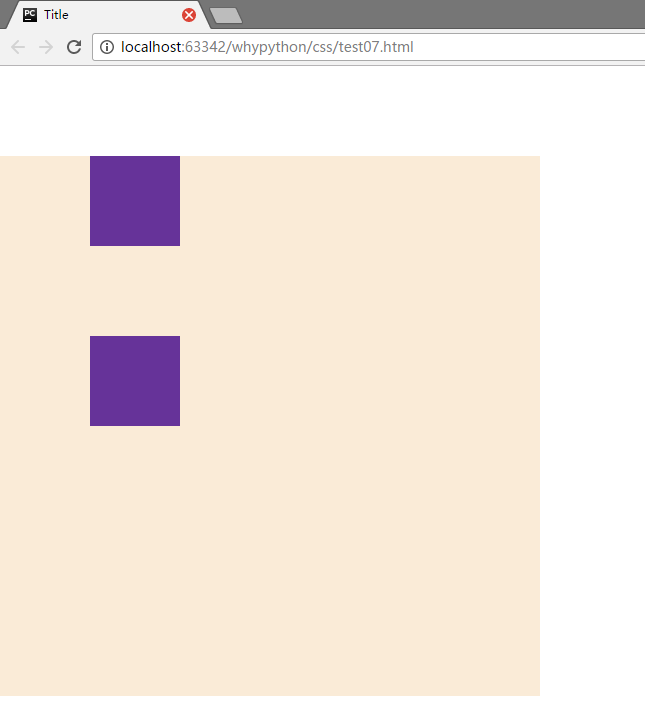
可以看到两个之间的距离为100px,margin写在inter中,inter两个是同级的标签,他们之间依然是重叠的100px,如果两个之间的不一致,以大的为主,而对于父子之间,父集也下降了100px,只加载到了inter中,而inter需要找一个边界距离100px,而大边框没有文本,border,padding,而这个是inter寻找边界的依据,找到最外层,找到了进行100px的距离,而outer也跟着降了100px
通过大盒子的padding进行居中
示例代码
<!DOCTYPE html>
<html lang="en">
<head>
    <meta charset="UTF-8">
    <title>Title</title>
    <style>
        body{
            margin: 0;
        }
        .outer{
            width: 300px;
            height: 300px;
            background-color: antiquewhite;
            border: 1px solid transparent;
            padding-top: 100px;
            padding-left: 100px;
        }
        .inter{
            width: 100px;
            height: 100px;
            background-color: rebeccapurple;
        }
    </style>
</head>
<body>
<div class="outer">
    <div class="inter"></div>
</div>
</body>
</html>
展示效果
看中间红框中的padding大小会变
<!DOCTYPE html>
<html lang="en">
<head>
    <meta charset="UTF-8">
    <title>Title</title>
    <style>
        body{
            margin: 0;
        }
        .outer{
            width: 200px;
            height: 200px;
            background-color: antiquewhite;
            border: 1px solid transparent;
            <!--padding-top: 100px;-->
            <!--padding-left: 100px;-->
        }
        .inter{
            width: 100px;
            height: 100px;
            background-color: rebeccapurple;
            margin: 20px;
        }
    </style>
</head>
<body>
<div class="outer">
    <div class="inter"></div>
</div>
</body>
</html>
<!DOCTYPE html>
<html lang="en">
<head>
    <meta charset="UTF-8">
    <title>Title</title>
    <style>
        body{
            margin: 0;
        }
        .outer{
            width: 200px;
            height: 200px;
            background-color: antiquewhite;
            border: 1px solid transparent;
            padding-top: 100px;
            padding-left: 100px;
        }
        .inter{
            width: 100px;
            height: 100px;
            background-color: rebeccapurple;
        }
    </style>
</head>
<body>
<div class="outer">
    <div class="inter"></div>
</div>
</body>
</html>
float
文本流控制
正常文本流
<!DOCTYPE html>
<html lang="en">
<head>
    <meta charset="UTF-8">
    <title>Title</title>
    <style>
        .div1{
            width: 300px;
            height: 100px;
            background-color: bisque;
        }
        .div2{
            width: 400px;
            height: 200px;
            background-color: royalblue;
        }
        .div3{
            width: 500px;
            height: 300px;
            background-color: blueviolet;
        }
        .div4{
            width: 100px;
            height: 200px;
            background-color: gold;
        }
    </style>
</head>
<body>
<div class="div1"></div>
<div class="div2"></div>
<div class="div3"></div>
<div class="div4"></div>
</body>
</html>
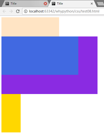
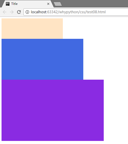
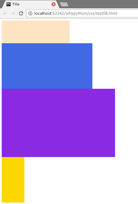
展示效果
div2脱离文档流向左飘
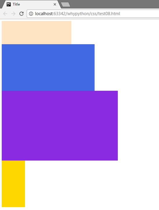
        .div2{
            width: 400px;
            height: 200px;
            background-color: royalblue;
            float: left;
        }
展示效果
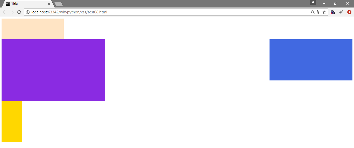
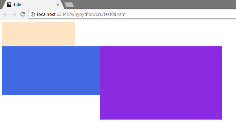
div2脱离文档流向右飘
        .div2{
            width: 400px;
            height: 200px;
            background-color: royalblue;
            float: right;
        }
展示效果
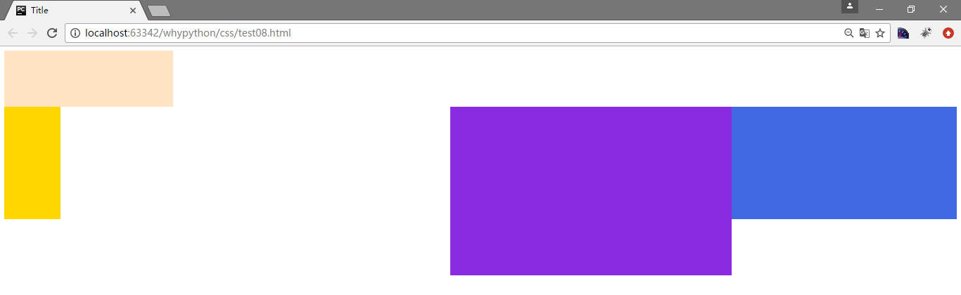
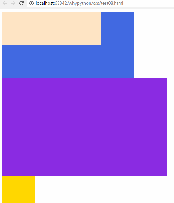
div2和div3同时脱离文档流向右飘
        .div2{
            width: 400px;
            height: 200px;
            background-color: royalblue;
            float: right;
        }
        .div3{
            width: 500px;
            height: 300px;
            background-color: blueviolet;
            float: right;
        }
展示效果
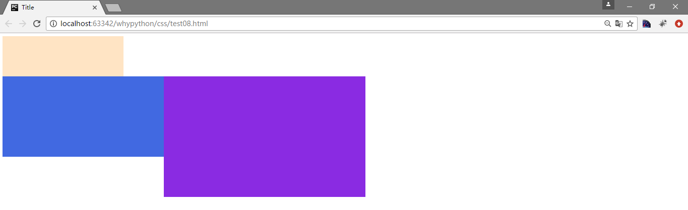
div2和div3同时脱离文档流向左飘
        .div2{
            width: 400px;
            height: 200px;
            background-color: royalblue;
            float: left;
        }
        .div3{
            width: 500px;
            height: 300px;
            background-color: blueviolet;
            float: left;
        }
展示效果
 还有一个要注意的点,div2和div3是浮动对象,而前者div1不为浮动对象,div2是不跟随div1
div3不能存在向左飘文档流
        .div2{
            width: 400px;
            height: 200px;
            background-color: royalblue;
            float: left;
        }
        .div3{
            width: 500px;
            height: 300px;
            background-color: blueviolet;
            float: left;
            clear: left;
        }
展示效果
clear是告诉标签左边不能有left的浮动对象,而不是说把left取消
div2不能存在向右飘文档流
        .div2{
            width: 400px;
            height: 200px;
            background-color: royalblue;
            float: left;
            clear: right;
        }
        .div3{
            width: 500px;
            height: 300px;
            background-color: blueviolet;
            float: left;
        }
展示效果
 div2只能控制自己在排列的时候没有left和right,而后div3排列。
clear的值默认为none,可选项none,left,right和both
- none:默认值。允许两边都可以有浮动对象
- left:不允许左边有浮动对象
- right:不允许右边有浮动对象
- both:不允许有浮动对象
position
static按照静态
<!DOCTYPE html>
<html lang="en">
<head>
    <meta charset="UTF-8">
    <title>Title</title>
    <style>
        .div1{
            width: 300px;
            height: 100px;
            background-color: bisque;
            position: static;
        }
        .div2{
            width: 400px;
            height: 200px;
            background-color: royalblue;
        }
        .div3{
            width: 500px;
            height: 300px;
            background-color: blueviolet;
        }
        .div4{
            width: 100px;
            height: 200px;
            background-color: gold;
        }
    </style>
</head>
<body>
<div class="div1"></div>
<div class="div2"></div>
<div class="div3"></div>
<div class="div4"></div>
</body>
</html>
static会按照文档流正常排放
展示效果
fixed
fixed可以固定到固定位置,不随
        .div1{
            width: 300px;
            height: 100px;
            background-color: bisque;
            position: fixed;
        }
展示效果
relative
这时它是不脱离文档流,只是按照当前的位置调整
        .div1{
            width: 300px;
            height: 100px;
            background-color: bisque;
            position: relative;
            left: 400px;
        }
展示效果
可以设置top,right,bottom,left
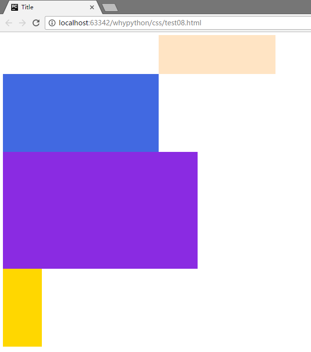
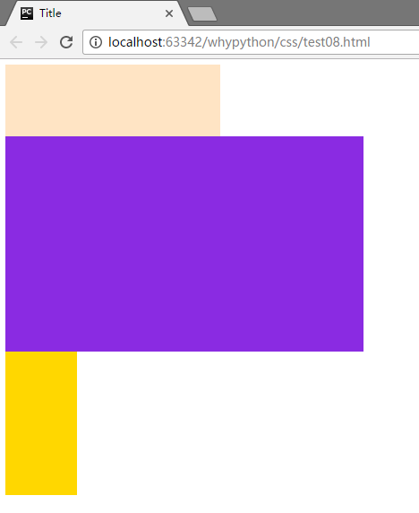
absolute
absolute会脱离文档流,按照上一级位置进行调整
        .div1{
            width: 300px;
            height: 100px;
            background-color: bisque;
        }
        .div2{
            width: 400px;
            height: 200px;
            background-color: royalblue;
            position: absolute;
            left: 50px;
            top: 50px;
        }
展示效果
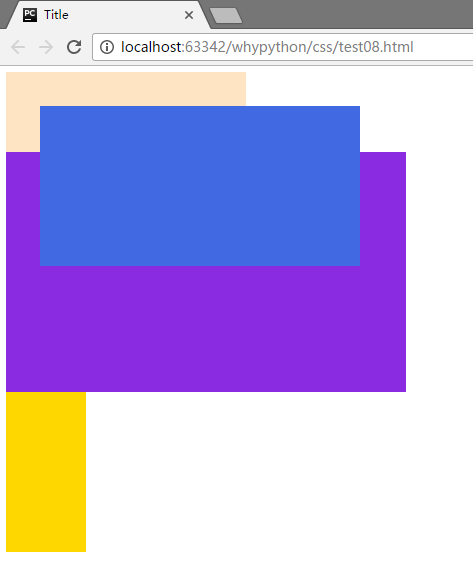
脱离文档流,并且根据脱离文档流的位置进行定位
<!DOCTYPE html>
<html lang="en">
<head>
    <meta charset="UTF-8">
    <title>Title</title>
    <style>
        .div1{
            width: 300px;
            height: 100px;
            background-color: bisque;
        }
        .div2{
            width: 400px;
            height: 200px;
            background-color: royalblue;
            position: absolute;
            left: 50px;
            top: 50px;
        }
        .div3{
            width: 500px;
            height: 300px;
            background-color: blueviolet;
        }
        .div4{
            width: 100px;
            height: 200px;
            background-color: gold;
        }
        .div5{
            position: relative
        }
    </style>
</head>
<body>
<div class="div1"></div>
    <div class="div5">
<div class="div2"></div>
        </div>
<div class="div3"></div>
<div class="div4"></div>
</body>
</html>
展示效果
层叠效果
示例代码只是在上一个的基础上添加了z-index
<!DOCTYPE html>
<html lang="en">
<head>
    <meta charset="UTF-8">
    <title>Title</title>
    <style>
        .div1{
            width: 300px;
            height: 100px;
            background-color: bisque;
        }
        .div2{
            width: 400px;
            height: 200px;
            background-color: royalblue;
            position: absolute;
            left: 50px;
            top: 50px;
            z-index: -1
        }
        .div3{
            width: 500px;
            height: 300px;
            background-color: blueviolet;

        }
        .div4{
            width: 100px;
            height: 200px;
            background-color: gold;
        }
        .div5{
            position: relative
        }
    </style>
</head>
<body>
<div class="div1"></div>
    <div class="div5">
<div class="div2"></div>
        </div>
<div class="div3"></div>
<div class="div4"></div>
</body>
</html>
展示效果
登录的时候,登录的内容就在上边,下边的不能点,就是通过这个层叠的功能实现。

